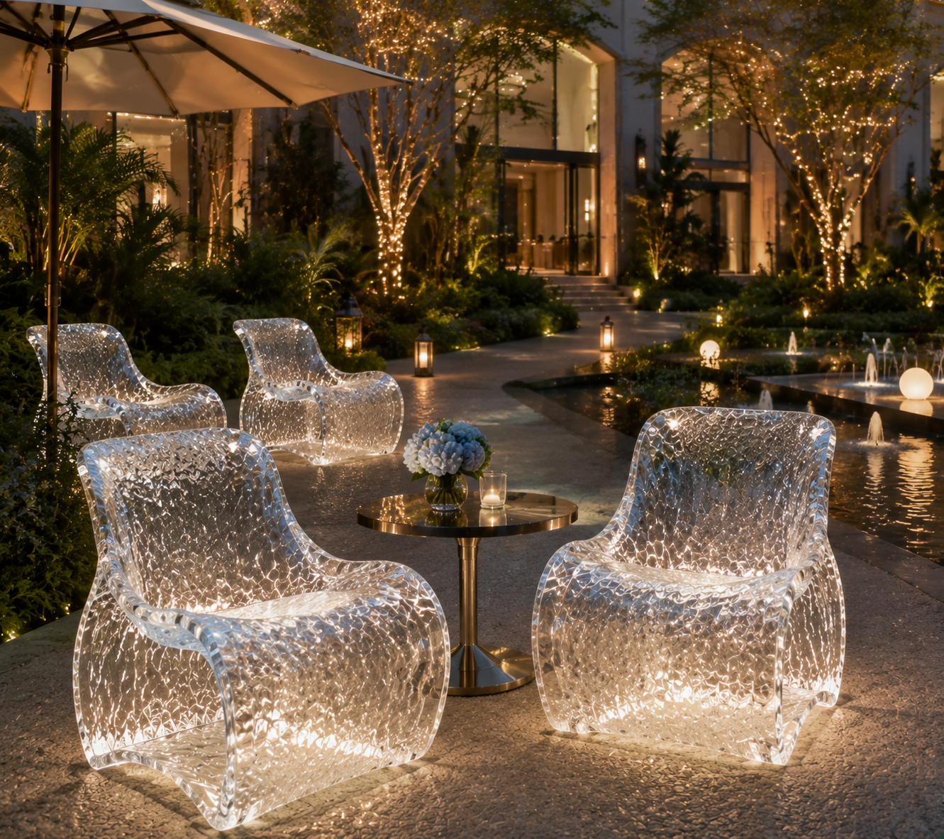
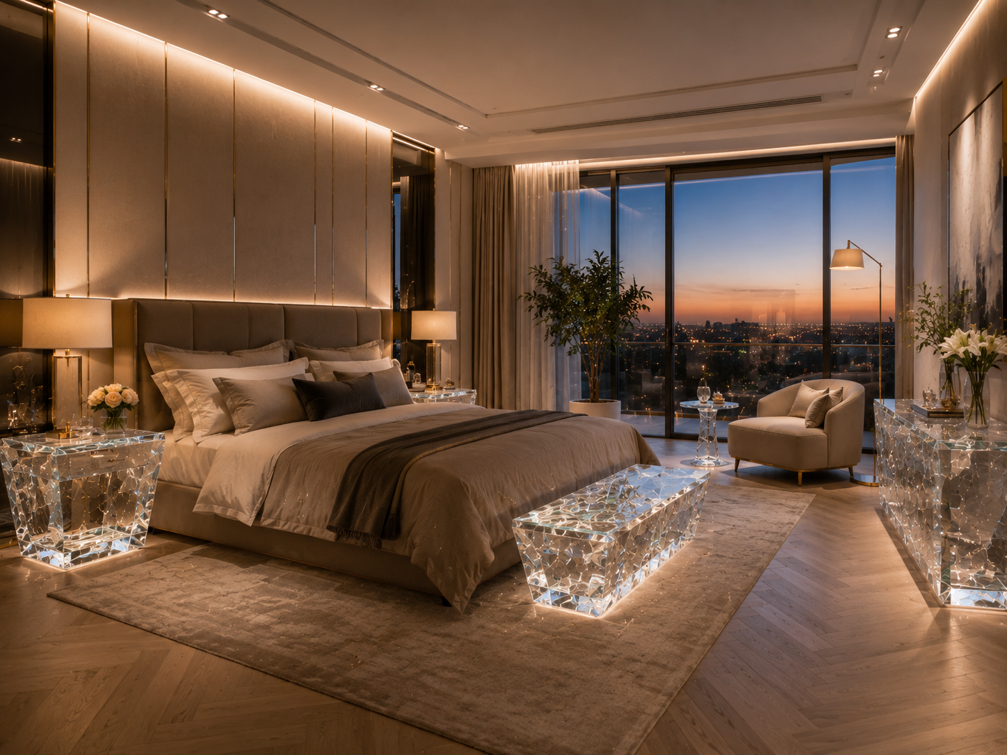
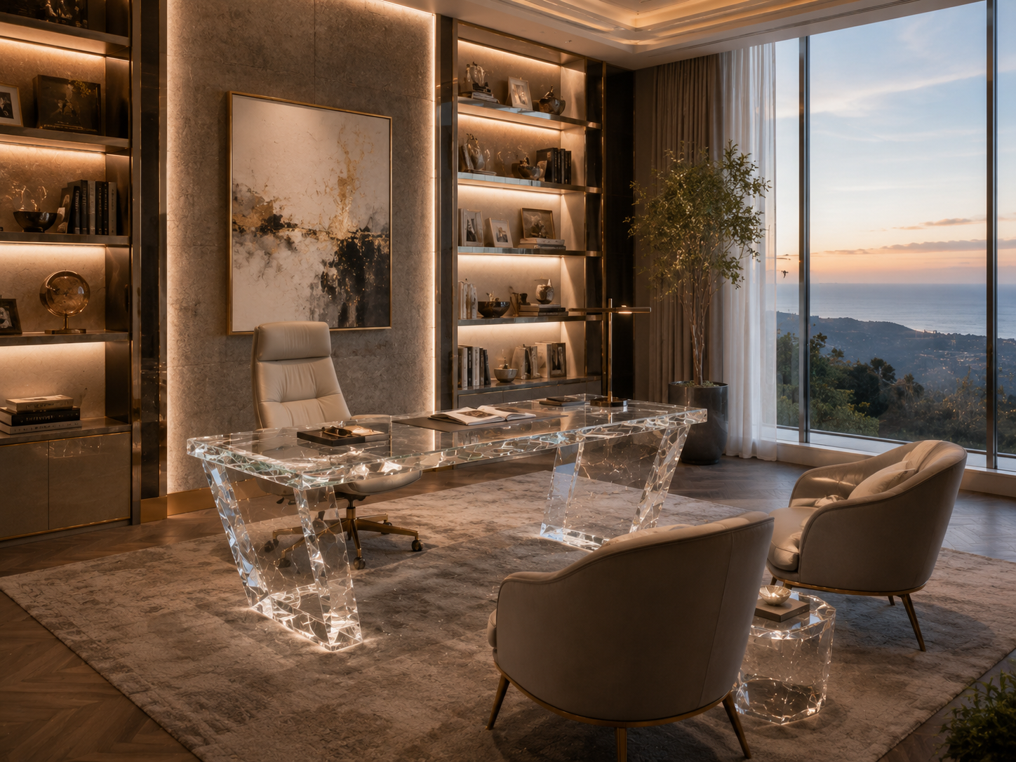
In interior design, a room can be physically large yet still feel dense, crowded, or visually exhausting. The problem is often not the actual floor area, but the amount of visual obstruction created by furniture, partitions, finishes, and decorative objects. Thick table bases, dark cabinets, opaque partitions, oversized upholstered forms, and strongly contrasting surfaces interrupt sightlines and make the eye repeatedly stop. As a result, the space feels heavier than its dimensions suggest.
Transparent and translucent materials offer designers another way to manage this problem. Instead of reducing the quantity of furniture or relying only on pale colors, designers can lower the visual weight of selected objects while preserving their practical function. A console can still define an entrance, a dining table can still accommodate eight people, and a sculptural pedestal can still become a focal point—without behaving like a solid visual barrier.
This is where synthetic crystal, high-end resin, and premium high-clarity acrylic—referred to in this article as platinum acrylic—become particularly valuable. These materials are not simply substitutes for glass. They can be cast in substantial dimensions, polished to create optical depth, colored with controlled translucency, formed into sculptural geometries, or embedded with decorative elements. Their design potential ranges from almost invisible architectural furniture to expressive objects that appear to capture light within their volume.
However, transparency alone does not automatically make a space feel lighter. Poorly proportioned clear furniture can still look bulky. Low-quality surfaces can create glare, distortion, scratches, or a commercial-display appearance. A successful result depends on how the designer controls optical clarity, thickness, reflection, color, placement, lighting, and the relationship between transparent and opaque materials.
The following six principles explain how experienced designers use transparent materials to reduce spatial heaviness while maintaining comfort, functionality, and a genuinely high-end atmosphere.
1. Evaluate Visual Weight, Not Only Physical Dimensions
The first step is to separate physical size from visual weight.
A large piece of furniture does not always feel heavy, and a small piece does not always feel light. A long transparent console may occupy more floor area than a compact dark cabinet, yet the cabinet can dominate the room because it blocks more of the wall, interrupts the floor line, and creates a strong contrast with its surroundings.
Visual weight is influenced by several factors:
How much of the background an object hides.
Whether the floor continues to be visible beneath or through it.
The thickness and darkness of its edges.
The amount of contrast between the furniture and the room.
The depth of its texture.
Whether it reflects, transmits, absorbs, or diffuses light.
The height at which it interrupts the viewer’s sightline.
Scientific research supports the idea that material characteristics influence how large or confined an interior feels. A virtual-reality study published through the U.S. National Library of Medicine found that wall texture, surface reflectivity, texture depth, hardness, and the associations people make with particular materials can affect perceived spaciousness. The effect was especially significant in relatively small rooms, where surface characteristics had a stronger influence on spatial perception.
Another study examining residential living rooms found that width, depth, ceiling height, room shape, and access to outward views significantly affected occupants’ perceptions of amenity. Wider and shallower rooms were generally perceived more positively than deeper spaces in which views were blocked.
These findings have direct implications for furniture selection. A designer working in a narrow living room should not evaluate a coffee table only by its dimensions. The more important question is: how much of the room does the table visually conceal?
Consider two coffee tables of identical size. The first has a dark timber top, a deep apron, and a solid box base. The second is formed from polished transparent resin with open space beneath the top. Both occupy the same footprint, but the second allows the rug pattern, flooring, and surrounding furniture to remain visually continuous. The room therefore feels less interrupted.
For practical projects, designers can conduct a visual-weight audit before selecting furniture. Stand at the main entrance to the room, at the primary seating position, and along the most important circulation path. Identify which objects block the longest views. These are often the best candidates for replacement with transparent or translucent materials.
In a luxury apartment entrance, for example, a solid marble console may create an impressive first impression but also narrow the visual corridor. A synthetic-crystal console with a carefully polished form can provide the same functional surface while allowing the wall finish, artwork, and floor pattern to remain visible. In a boutique hotel suite, transparent bedside tables can reduce the mass around an upholstered bed without making the room feel under-furnished.
The objective is not to make every object disappear. It is to decide which objects should carry visual weight and which should release it.

2. Select the Correct Degree of Transparency
One of the most common mistakes in transparent furniture design is assuming that maximum clarity is always the best choice.
In reality, transparency exists on a spectrum. A material may be water-clear, lightly tinted, frosted, internally textured, partially opaque, layered, embedded with decorative elements, or designed to transmit light while obscuring detailed views. Each condition produces a different spatial effect.
Premium clear acrylic can achieve very high visible-light transmission. Technical information published by ACRYLITE states that colorless, smooth acrylic sheet can provide approximately 92 percent light transmission. This optical clarity makes acrylic valuable for furniture intended to preserve sightlines or appear visually minimal.
Yet high light transmission does not mean that every object should be completely transparent. A perfectly clear table placed against a visually busy background may almost disappear, leaving the room without sufficient hierarchy. It may also reveal cables, fingerprints, floor irregularities, or construction details that the designer would rather conceal.
The correct transparency level should therefore be selected according to function.
A clear synthetic-crystal console works well where the intention is to preserve an uninterrupted view of a decorative wall. A lightly smoked platinum-acrylic side table may be more suitable beside a pale sofa because the tint gives the object a readable silhouette. A translucent resin dining-table base can conceal internal connections while still allowing light to pass through. A frosted resin partition can divide a dressing area without closing it off completely.
High-end resin offers an especially broad range of optical possibilities. Pigments, minerals, metallic particles, fabrics, botanical forms, or decorative inclusions can be embedded within the material. When controlled carefully, these elements appear suspended in depth rather than applied to the surface. The object gains visual richness without becoming an opaque block.
Shiro Kuramata’s 1988 Miss Blanche Chair, held in the Museum of Modern Art’s collection, remains an important reference. The chair uses acrylic resin to suspend artificial flowers within a transparent body, allowing decorative content to appear as if it is floating in space. The result demonstrates that transparency can carry narrative and emotional value rather than functioning only as visual absence.
For designers, the most useful approach is to define transparency according to four practical levels:
Optically clear: Best for small rooms, open sightlines, sculptural objects, and furniture positioned in front of important architectural surfaces.
Lightly tinted: Best for introducing contrast, coordinating with metal finishes, or making furniture edges easier to perceive.
Translucent: Best for diffusing light, providing partial privacy, hiding structural connections, and creating a softer atmosphere.
Decoratively embedded: Best for statement furniture, hospitality spaces, luxury retail, and projects requiring a distinctive material identity.
The thickness of the object must also be considered. A thin clear panel can appear almost weightless, while a thick clear block produces refraction, edge brightness, and optical depth. This can be desirable in luxury furniture, but the form should be proportioned carefully. A very thick transparent base may become a deliberate sculptural mass rather than a visually invisible element.
The goal is not simply to choose a transparent material. It is to specify exactly how transparent the object should be, what it should reveal, what it should conceal, and how its optical character supports the overall design concept.
3. Preserve Sightlines, Circulation, and Daylight
Transparent furniture is most effective when it protects the visual continuity of a room.
People do not perceive space only through floor area. They read distance through overlapping surfaces, visible corners, continuous flooring, ceiling lines, windows, and the relationship between near and far objects. When these references remain visible, a room usually feels more open. When furniture repeatedly interrupts them, the space feels fragmented.
This is why transparent materials are particularly useful in long, narrow, or multifunctional interiors.
In an open-plan residence, for example, an opaque dining table can create a strong visual barrier between the living area and the kitchen. Replacing its solid base with a transparent resin or platinum-acrylic structure allows the flooring and surrounding chairs to remain visible. The table still defines the dining zone, but it no longer divides the room as forcefully.
In a luxury retail environment, clear display plinths allow merchandise to appear at different heights without creating a forest of opaque blocks. Customers can understand the entire store more quickly, and visual connections between displays are maintained.
In a hotel lobby, transparent side tables and consoles can reduce congestion around circulation routes. This is particularly important where the designer needs generous furniture for comfort but does not want guests to perceive the lobby as crowded.
The same logic applies to daylight. Transparent furniture does not create daylight, but it can reduce unnecessary obstruction and allow available light to travel through or around furniture more effectively.
The WELL Building Standard uses daylight metrics to evaluate whether regularly occupied spaces receive an appropriate amount of natural light. One referenced target is for at least 55 percent of regularly occupied space to receive at least 300 lux of daylight for at least 50 percent of operating hours, while excessive direct exposure must also be controlled.
The U.S. Department of Energy similarly emphasizes that daylighting must be coordinated with interior design, glazing, shading, and electric lighting. Its guidance notes that daylight can support human comfort and reduce dependence on artificial lighting, although glare and heat must be managed.
These principles are relevant to furniture specification. A large opaque cabinet positioned perpendicular to a window may block daylight from reaching deeper into a room. A transparent or translucent storage and display element may preserve more light distribution while still defining the required zone.
A practical example can be found in a compact urban apartment with a single primary window. The designer may need a home-office desk near the window, a dining table in the center, and a living area farther inside. If both the desk and dining table use heavy dark bases, the interior zone may feel visually separated from the window. A clear acrylic desk and a translucent resin dining-table base allow the eye to continue toward the exterior view.
Placement is as important as material. Transparent furniture should not be used randomly. It is most valuable in three positions:
First, in front of windows, artwork, textured walls, or architectural details that should remain visible.
Second, along important sightlines between entrances, seating areas, and exterior views.
Third, in circulation zones where an opaque object would make movement feel restricted.
Designers should also consider the height of transparency. A clear base beneath an opaque tabletop still releases the lower half of the room visually. A translucent partition above eye level may distribute light but still feel enclosing. A completely clear console may preserve the wall view but require stronger edge detailing for safety and visual definition.
The best transparent furniture does not merely occupy less visual space. It helps the room read as one continuous environment.
4. Treat Light as Part of the Material
Transparent materials do not have a fixed appearance. They change throughout the day according to the direction, intensity, temperature, and color of light.
This is one of their greatest design advantages—and one of the main reasons they require careful specification.
An opaque timber cabinet usually maintains a relatively stable visual identity under different lighting conditions. A clear resin table, by contrast, may appear almost invisible under diffuse daylight, highly reflective under direct sunlight, warm and luminous under 2700K lighting, or cool and architectural under 4000K illumination.
The material should therefore be selected together with the lighting strategy, not after it.
Research into the perception of transparency and translucency has found that light transmission, internal scattering, surface roughness, and reflection all influence whether an object appears transparent, translucent, glossy, or frosted. Even a highly light-transmitting material may appear less transparent when its surface reflection is blurred or its internal scattering is increased.
For designers, this means that a resin sample viewed under showroom lighting is not enough. Samples should be tested under the actual project conditions whenever possible.
There are four primary lighting relationships to consider.
Front lighting emphasizes surface gloss, polishing quality, scratches, fingerprints, and reflection. It can make a clear object feel glamorous, but excessive front lighting may produce distracting highlights.
Backlighting reveals internal depth, suspended inclusions, pigments, bubbles, layers, and translucent color. It is particularly effective for synthetic crystal and decorative resin furniture.
Side lighting emphasizes edges, thickness, geometry, and refractive effects. A polished acrylic edge can capture light and appear brighter than the main surface, giving the object a precise architectural outline.
Diffuse ambient lighting reduces harsh reflection and gives clear furniture a softer, quieter presence.
ArchDaily’s review of translucent materials in contemporary architecture notes that such materials can create distinctive atmospheres by filtering light, moderating views, and establishing a different relationship between separated spaces. Although the examples include architectural surfaces, the same principle applies at furniture scale.
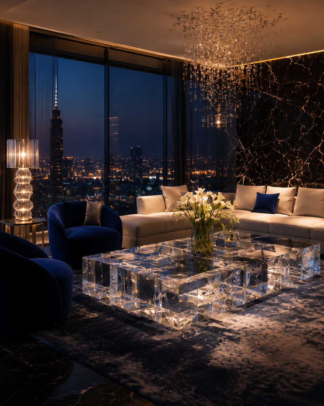
A translucent resin console placed against an illuminated wall can appear to glow without containing any internal light source. A synthetic-crystal coffee table positioned near a window can project subtle reflections onto the floor. A thick platinum-acrylic pedestal with polished edges can produce a luminous outline under focused gallery lighting.
For residential interiors, designers should avoid treating every transparent object as a lighting feature. Too many reflective surfaces can create visual noise. A more refined strategy is to identify one or two pieces that actively interact with light while allowing the remaining transparent elements to stay quiet.
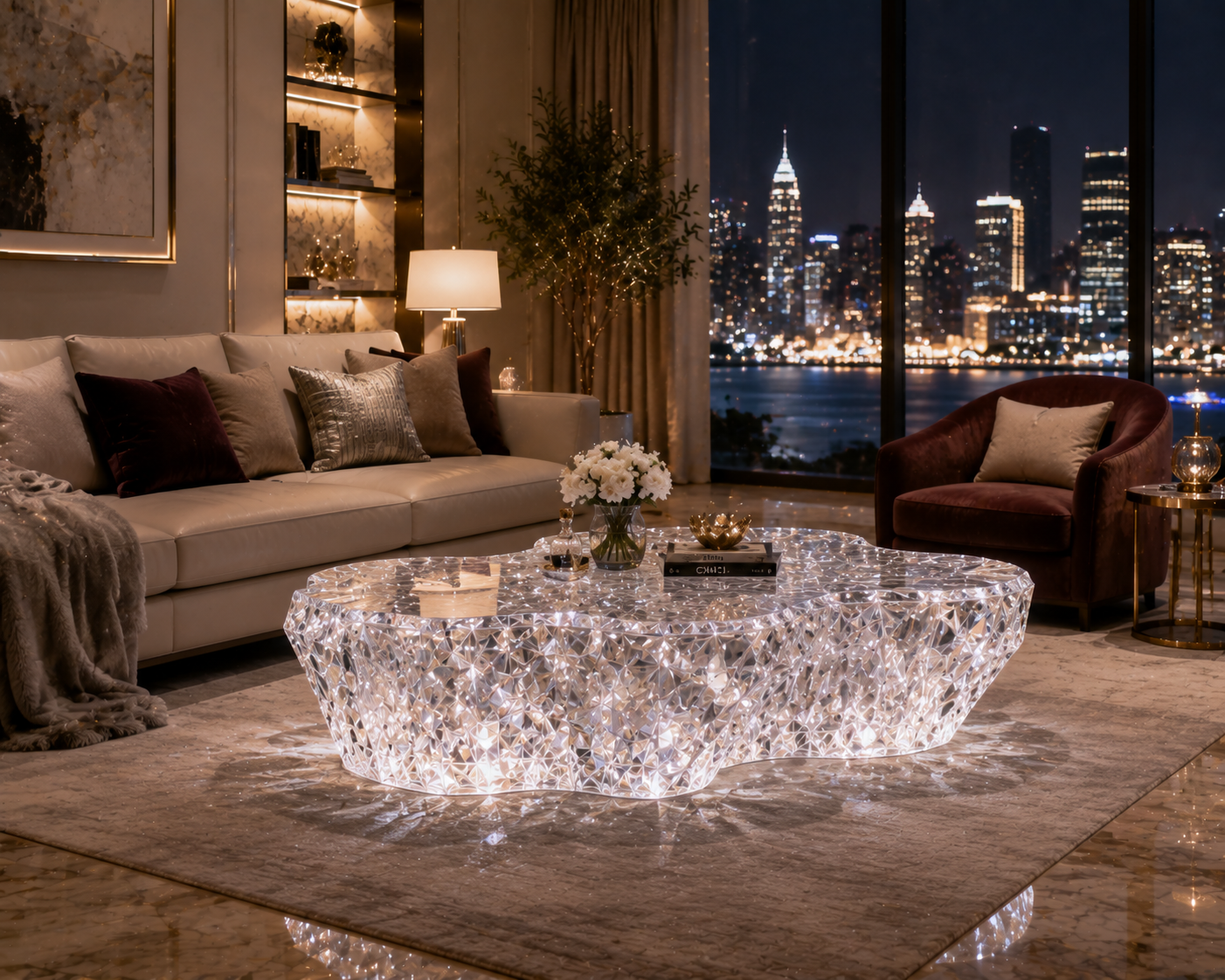
For example, a living room might use a highly polished synthetic-crystal coffee table as the main luminous object, while secondary side tables use a softer satin finish. In a dining room, a translucent resin base may be illuminated from above, while the tabletop remains optically clear. In a luxury boutique, embedded resin plinths may receive controlled backlighting, while clear acrylic shelves are lit more evenly.
Color temperature should also be tested. Warm light can soften clear materials and enhance amber, champagne, and bronze tints. Cooler light may strengthen blue, grey, and crystal-clear effects. The surrounding materials matter as well: clear furniture will reflect nearby stone, timber, metal, fabrics, and artwork.
The designer is therefore not selecting a single static color. The designer is creating a material that changes in response to its environment.
5. Balance Transparent Elements with Opaque Anchors
A room made entirely from transparent furniture may feel visually light, but it can also feel unstable, cold, or lacking in hierarchy.
High-end interiors require contrast. Transparency becomes most effective when placed beside materials that provide warmth, texture, tactility, or architectural weight.
The objective is not to eliminate mass. It is to control where mass appears.
A stone fireplace, upholstered sofa, timber wall panel, bronze cabinet, or sculptural rug can serve as an opaque anchor. Transparent furniture then creates visual breathing room around that anchor.
Consider a formal living room with a large velvet sofa. Adding a heavy timber coffee table, two stone side tables, and a solid console may make the seating group feel overloaded. A transparent synthetic-crystal coffee table and two lightly tinted acrylic side tables allow the sofa to remain the main visual mass. The room still feels furnished, but the hierarchy becomes clearer.
In a dining room, the table may combine a transparent resin base with a solid stone or timber top. This preserves a sense of substance at hand level while releasing the floor plane below. Alternatively, a clear tabletop can be supported by sculptural opaque bases, making the bases appear like individual objects rather than a continuous barrier.
This balance is also essential when using decorative resin. A resin piece containing metallic particles, botanicals, stone fragments, or layered pigments already carries significant visual information. It should usually be surrounded by quieter finishes. Placing multiple highly decorative resin pieces in the same view can make the room feel busy, even if the materials are technically transparent.
Designers should therefore work with three forms of balance:
Optical balance: Combine clear, translucent, and opaque surfaces so that the eye has both open and defined areas.
Textural balance: Pair smooth polished resin or acrylic with fabrics, timber grain, stone, leather, or brushed metal.
Proportional balance: Use transparent materials for pieces that would otherwise create excessive bulk, while allowing selected architectural features to retain solidity.
This approach is particularly effective in luxury spaces because it avoids the misconception that “more material” automatically means “more premium.” Luxury often depends on precision, restraint, and the controlled relationship between materials.
The Miss Blanche Chair offers a useful historical lesson. Its transparent acrylic body does not eliminate visual content; instead, it creates a clear volume in which the flowers become the focal point. The transparency supports the decorative idea rather than competing with it.
A similar strategy can be used in contemporary furniture. A clear resin table with a single embedded mineral formation may feel more sophisticated than a surface filled with multiple decorative effects. A lightly tinted acrylic cabinet beside a textured stone wall may feel richer than either material used alone.
For small rooms, a practical rule is to make the largest secondary objects visually lighter. The sofa, bed, dining chairs, or architectural feature can remain the anchor. Coffee tables, consoles, occasional tables, benches, plinths, and selected storage elements can then use transparent or translucent materials.
For larger spaces, transparent furniture can also prevent the room from becoming overfilled as the furniture scale increases. A large luxury residence may require substantial dimensions, but not every substantial object must read as a solid mass.
The best result is a room that feels grounded without feeling blocked.

6. Specify Details That Make Transparency Feel Luxurious
Transparent materials are unforgiving. In opaque furniture, small construction imperfections can often be concealed. In clear resin or acrylic, edges, joints, bubbles, inclusions, internal stress, adhesive lines, polishing marks, and structural connections may remain visible.
For this reason, the quality of transparent furniture depends heavily on detailing and manufacturing control.
The first priority is edge quality. Polished edges should be consistent, clear, and free from visible tool marks. Designers should determine whether edges are intended to disappear, catch light, or become a deliberate profile. A thick, brightly polished edge can create a jewel-like effect. A poorly polished edge can make the same piece appear unfinished.
The second priority is joint strategy. Connections can be hidden, celebrated, or integrated into the form, but they should never appear accidental. Designers should review how legs connect to tops, how embedded hardware is concealed, and how loads are transferred through the material.
The third priority is optical consistency. For clear furniture, designers should establish acceptable limits for haze, bubbles, color variation, inclusions, and distortion. In decorative resin, bubbles or irregularities may be intentional, but the distinction between controlled character and manufacturing defect must be defined.
The fourth priority is surface performance. Transparent surfaces reveal fingerprints, dust, and scratches more readily than many opaque materials. The intended use should determine the finish, hardness, cleaning method, and maintenance instructions. A clear pedestal used in a controlled gallery setting has different requirements from a dining table used every day.
The fifth priority is environmental exposure. Direct sunlight, heat sources, cleaning chemicals, and mechanical stress can affect long-term appearance and performance. Technical data for acrylic products commonly warn that chemical compatibility, thermal expansion, installation methods, and temperature conditions must be considered in design and fabrication.
High-end resin furniture also requires careful control of curing, pigment stability, thickness, internal temperature during casting, and ultraviolet exposure. For important projects, designers should request production samples representing the final thickness—not only thin color chips—because optical depth and color can change dramatically with section size.
Structural requirements must be verified by the manufacturer or an appropriately qualified engineer. Transparent materials may appear visually light, but furniture still has to carry real loads. Thickness, span, support geometry, connection design, and expected impact conditions should be calculated rather than selected only for appearance.
Long-term value should also be part of the specification. The Ellen MacArthur Foundation highlights modularity, repair, disassembly, upgrades, and life extension as important principles for more circular furniture systems. Its Ahrend case study illustrates how furniture designed for maintenance and component replacement can preserve material value for longer.
For premium transparent furniture, this can translate into replaceable protective components, removable hardware, repairable surfaces, detachable tops, and designs that can be refinished rather than discarded.
Before approving a synthetic-crystal, resin, or platinum-acrylic furniture piece, the designer should review:
Full-size or representative-thickness samples.
Edge-polishing standards.
Acceptable bubble and inclusion tolerances.
Color consistency under daylight and artificial lighting.
Joint and adhesive visibility.
Structural-load requirements.
Scratch and cleaning expectations.
Resistance to heat and ultraviolet exposure.
Packaging and installation procedures.
Repair, refinishing, and component-replacement options.
These details are what separate a sophisticated transparent object from a generic clear product.
Conclusion
Using transparent materials to reduce spatial heaviness is not simply a matter of replacing solid furniture with clear furniture. It is a method of controlling visual obstruction, preserving sightlines, distributing light, establishing hierarchy, and deciding where an interior should feel solid or open.
Synthetic crystal, high-end resin, and platinum acrylic give designers a broad vocabulary. They can be optically clear, softly translucent, tinted, sculptural, layered, embedded, polished, or illuminated. They can almost disappear into a room or become its central artistic statement.
The most successful projects begin by identifying where visual mass is creating unnecessary pressure. Designers then select the appropriate level of transparency, protect key sightlines, coordinate the material with daylight and artificial lighting, and balance it with opaque architectural anchors.
Finally, the manufacturing details must match the ambition of the design. Edge quality, optical consistency, structural engineering, surface durability, and long-term maintenance determine whether a transparent piece feels refined or temporary.
When these decisions are made carefully, transparent furniture does more than make a room look larger. It creates a more fluid relationship between objects, light, architecture, and the people moving through the space.
READ MORE:
- Come aumentare il valore dello spazio attraverso texture, lucentezza e trasparenza
- Guardare da vicino la texture del mobile: il vero lusso si nasconde nei dettagli visibili
- Dal "bello" al "sofisticato": i 3 fattori chiave con cui i mobili in resina elevano la qualità dello spazio
- Negli spazi di alta gamma, ciò che si trascura più facilmente non è la forma, ma la qualità materica
- Mobili in cristallo acrilico sintetico: perché stanno conquistando il mercato dell’arredamento su misura di alta gamma?
- Mobili in cristallo acrilico sintetico: aprire nuovi spazi di crescita nel mercato dell’arredamento di alta gamma
- Perché sempre più marchi scelgono il cristallo acrilico sintetico per creare i propri prodotti di punta?
- Mobili in cristallo acrilico sintetico: un’innovazione materica da non ignorare nel design di alta gamma
- Dall’attrattiva visiva al riconoscimento del cliente: come i mobili in cristallo acrilico sintetico aumentano il valore del prodotto
READ MORE:
- How Custom Furniture Projects Can Reduce Delays and Improve Final Results
- Choosing Furniture Materials for Different Commercial Spaces: A Practical Guide
- How Luxury Furniture Brands Can Create More Value Through Material Storytelling
- How Design Companies Can Improve Material Selection Efficiency
- Let Us Help You Find a More Suitable Material Solution
- Come aumentare il valore dello spazio attraverso texture, lucentezza e trasparenza
- Guardare da vicino la texture del mobile: il vero lusso si nasconde nei dettagli visibili
- Dal "bello" al "sofisticato": i 3 fattori chiave con cui i mobili in resina elevano la qualità dello spazio
- Negli spazi di alta gamma, ciò che si trascura più facilmente non è la forma, ma la qualità materica


