In contemporary interior design, a “premium feel” is no longer achieved through expensive materials alone, but through visual order and aesthetic restraint. Among all design elements, furniture color matching and material selection play a decisive role. In particular, the combination of color and transparency has become a key strategy for creating modern, luxurious, and sophisticated spaces.
This article systematically explores how to elevate your interior design through three essential techniques, from theory to practical application.
1. The Importance of Furniture Color: Why Premium Design Relies on Color & Material
Color is the most direct visual language in any space. Different tones influence human emotions—cool tones evoke calmness and rationality, while warm tones bring energy and comfort. Furniture, as a visual focal point, not only enhances local aesthetics but also defines the overall style of a room.
A true “premium look” is not about extravagance, but about balance, layering, and restraint. Excessive colors or chaotic material combinations often make a space feel cluttered and inexpensive.
In recent years, transparent materials—especially acrylic furniture—have gained popularity. These materials reduce visual weight, increase spatial openness, and create unique light interactions when combined with color, significantly enhancing the overall sophistication of a space.
2. Understanding the Design Logic of “Color + Transparency”
Before selecting furniture colors, it’s essential to understand the three key attributes of color:
Hue (type of color)
Brightness (Value) (lightness or darkness)
Saturation (intensity or purity)
Transparency introduces another dimension. High-transparency materials visually “disappear,” making spaces feel lighter, while semi-transparent materials retain presence while softening visual impact.
When combined, color and transparency create three core relationships:
Solid-colored furniture as visual anchors
Transparent furniture as spatial buffers
Semi-transparent materials as transitional layers
Lighting also plays a critical role. Under strong lighting, transparent materials enhance reflection and refraction, adding depth. Under softer lighting, they create a calm and subtle ambiance.
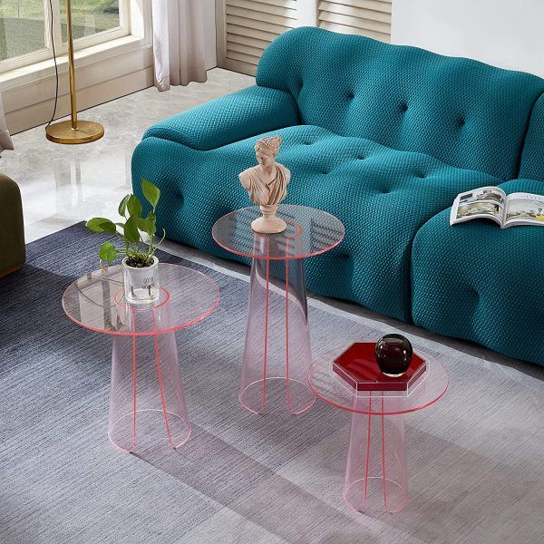
3. Tip 1: Low-Saturation Colors + High Transparency for Minimalist Luxury
Low-saturation colors, such as Morandi tones, are widely used in high-end interiors. These colors are soft, understated, and visually harmonious.
When paired with highly transparent furniture, they reduce visual density and create a more open environment. For example:
A grey-blue sofa with a transparent acrylic coffee table
A beige armchair paired with a clear side table
A muted green cabinet with transparent shelving
This combination works because transparency reduces the perceived “volume” of furniture, making the space feel lighter and more refined.
In living rooms, use low-saturation tones as the base and transparent pieces as accents. In bedrooms, transparent nightstands can reduce heaviness and promote relaxation.
Avoid using too many colors—limit the palette to 2–3 main tones for a cohesive look.
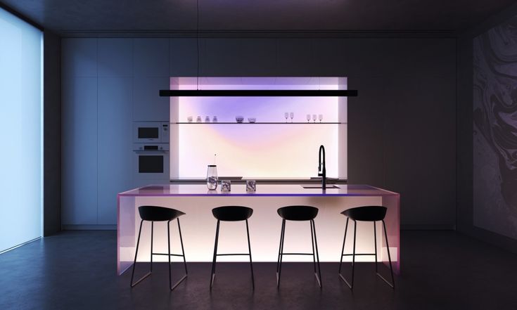
4. Tip 2: High-Contrast Colors + Partial Transparency for Layered Spaces
For a more dynamic visual effect, high-contrast color schemes are highly effective. Examples include black and white, dark gray and beige, or navy and light gray.
In these cases, transparent elements act as a visual buffer, softening strong contrasts. For instance:
A dark sofa with a transparent coffee table and a light rug
A black dining table paired with transparent chairs and wooden flooring
Transparency enhances spatial layering and clearly defines different zones without making the design feel heavy.
In dining areas, this approach creates elegance and sophistication. In office spaces, it enhances professionalism and clarity.
Be mindful of balance—use the 70-20-10 rule:
70% dominant color
20% secondary color
10% accent color
This prevents visual overload and maintains harmony.
5. Tip 3: Monochromatic Gradients + Semi-Transparency for Cohesive Elegance
Monochromatic schemes are one of the safest and most refined design strategies. By adjusting brightness and saturation within the same hue, you can create natural layering.
Examples include:
Light gray → medium gray → dark gray
Cream → beige → khaki
Light blue → dusty blue → navy
Semi-transparent materials, such as frosted acrylic, serve as perfect transitional elements. For example:
Frosted cabinet doors connecting different tonal sections
Gradient furniture combined with translucent decorative elements
This approach is especially effective in small spaces, where gradients and transparency can visually expand the room and add depth.
Start with a single furniture piece, such as a gradient cabinet, and gradually extend the concept to the entire space.
6. Practical Guide: Applying Color & Transparency in Different Spaces
1. Living Room
Use low-saturation tones as the base and transparent furniture (like acrylic coffee tables) as accents to maintain openness and modern appeal.
2. Bedroom
Focus on comfort with soft tones (beige, light gray) and minimal transparent elements to reduce visual weight without disrupting relaxation.
3. Dining Area
Incorporate contrast for energy—dark tables with transparent chairs create a balanced and stylish environment.
4. Workspace
Use neutral tones with transparent furniture to enhance clarity, productivity, and a sense of order.
5. Buying Tips
When selecting transparent furniture, prioritize high-quality acrylic materials known for high clarity, durability, and resistance to yellowing. Pay attention to edge finishing and structural stability for both safety and aesthetics.
Conclusion
The combination of color and transparency is not a simple layering technique, but a comprehensive design strategy. By applying:
Low saturation + high transparency
High contrast + partial transparency
Monochromatic gradients + semi-transparency
you can create a space that feels refined, balanced, and truly premium.
Once you begin to think in terms of both material and color, your interior design will naturally evolve to a more sophisticated level.
Contact
LinkedIn: https://www.linkedin.com/in/adtender-zyra/?locale=zh_CN
Facebook: https://www.facebook.com/profile.php?id=61586259131631
Instagram: https://www.instagram.com/zzzzyyrraa4/
YouTube: https://www.youtube.com/@ZZZZyra-k7w
Office: (904) 258-3290
WhatsApp/Wechat: +86 18923188839
READ MORE:
- From Failed Execution to Flawless Result — A Crystal Sculpture Reimagined
- Can lighting be integrated into structural transparent elements?
- How do you achieve seamless joints in complex shapes?
- Can thick Synthetic Crystal maintain clarity without distortion?
- From Material Fatigue to Repeat Purchases: How Durability Drives Long-Term Value
- Furniture Industry Trends: Regional Demand Shifts & Product Opportunities
- Is Transparent Material Worth It? Acrylic vs Other Materials—Full Comparison
- No Inspiration for Color Matching? 5 Sources to Spark Best-Selling Designs
- The Deeper Insights from Milan Expo: Consumers Are No Longer Just Buying 'Things', They Are Buying 'Feelings'


