A room rarely becomes refined because of one expensive object. More often, it becomes refined because every visible and touchable surface feels intentional. Among all design decisions, material selection is one of the most powerful because it affects how a space looks, performs, ages, sounds, reflects light, supports wellbeing, and communicates value. A sofa shape may attract attention first, but the material around it—the floor underfoot, the table surface, the wall finish, the cabinet texture, the chair frame, the hardware, and even the transparent elements that manage visual weight—determines whether the space feels ordinary or elevated.
Material choice is not simply decoration. It is a strategic design decision. The U.S. Environmental Protection Agency notes that people in the United States spend about 90% of their time indoors, and concentrations of some indoor pollutants are often two to five times higher than typical outdoor levels. That means interior materials are not passive backgrounds; they are part of the daily environment people breathe, touch, clean, maintain, and emotionally respond to.
A premium space therefore begins with a different question. Instead of asking, “What looks nice today?” the better question is, “What material will still look intentional, feel comfortable, support health, and communicate quality after years of use?” The following six points explain how one material decision can transform a room from basic to high-end.
1. Premium spaces begin with material honesty, not surface imitation
The first difference between an ordinary space and a sophisticated one is material honesty. Ordinary interiors often rely on imitation: plastic made to look like marble, thin laminate printed to resemble wood, or glossy coatings used to create instant visual drama. These choices may look acceptable in a quick photo, but in real use they often fail because the eye and hand notice inconsistencies. Edges chip. Printed patterns repeat. Surfaces feel hollow. Reflections look harsh. Over time, the room begins to feel artificial.
A premium space does not always require the most expensive material, but it does require the right material used honestly. Real wood, stone, metal, glass, leather, high-quality fabric, engineered surfaces, and acrylic can all feel elevated when their natural qualities are respected. Wood should show warmth and grain. Stone should express depth and variation. Metal should be used for precision, contrast, or structure. Acrylic should not pretend to be glass; its value lies in its clarity, sculptural flexibility, lightness, and modern visual transparency.
This matters in practical design. For example, a small apartment living room can feel crowded when it uses a heavy dark coffee table, thick shelving, and opaque storage pieces. Replacing just one central object with a clear acrylic coffee table changes the perception of space. The footprint remains functional, but the eye travels through the material rather than stopping at it. The room feels lighter without removing furniture. In this case, acrylic is not chosen because it is “fancy”; it is chosen because its material property solves a spatial problem.
Material honesty also supports emotional trust. When a dining table is made with a durable surface that can tolerate daily use, the user feels relaxed. When a cabinet handle has real weight, the user senses quality before consciously analyzing it. When a chair frame feels stable rather than decorative, the space becomes more credible. Premium interiors are often quiet because the materials do not need to overexplain themselves.
The National Association of Realtors’ Remodeling Impact Report provides a useful example of how material upgrades can translate into perceived and financial value. For interior projects, refinishing hardwood floors has been reported with strong cost recovery, while new wood flooring also ranks highly among interior improvements. These figures do not mean every project will produce the same result, but they show that buyers and homeowners often recognize the value of material improvements that affect large, daily-use surfaces.
The lesson is clear: material choice becomes premium when it aligns appearance, touch, function, and long-term credibility. A cheap-looking surface can weaken an otherwise expensive room, while a well-selected material can make a simple room feel designed.
2. Texture and tactility create the difference between “decorated” and “designed”
Visual style can be copied quickly, but tactile quality is harder to fake. This is why many ordinary spaces look complete in photos yet feel flat in person. They may have fashionable colors, trendy furniture shapes, and matching accessories, but the surfaces lack depth. Everything is either too smooth, too shiny, too thin, or too similar. A premium space, by contrast, uses material texture to create rhythm.
Texture works because people experience interiors with more than their eyes. They hear footsteps on flooring, feel the edge of a table, notice the softness of upholstery, and subconsciously read whether surfaces absorb or reflect light. A room with matte walls, brushed metal, woven fabric, natural wood, and a clear acrylic accent can feel layered even if the color palette is minimal. The interest comes from the interaction of materials rather than from visual clutter.
In real projects, this is especially important for neutral interiors. Many clients request beige, white, grey, or cream spaces because they want calmness. But without material contrast, neutral rooms can become dull. The solution is not necessarily more color; it is better material hierarchy. A warm oak floor, a linen-textured wallcovering, a marble or stone tabletop, a soft boucle chair, and a transparent acrylic console can create a high-end atmosphere while staying within a restrained palette.
Tactility also helps define zones. In an open-plan apartment, material selection can separate functions without adding walls. A wood dining table may signal warmth and gathering. A polished stone kitchen island may communicate durability and hygiene. A soft rug may establish the lounge area. A clear acrylic side table may keep the transition between zones visually open. Each material contributes to spatial organization.
This is where professional design differs from simple decoration. Decoration often adds objects after the room is finished. Design builds quality into the surfaces people use every day. A premium material strategy asks which textures should dominate, which should support, and which should disappear. Not every material should compete for attention. In many elegant interiors, one material acts as the hero while others create balance.
For example, if a room already has dramatic stone flooring, the furniture materials should be calmer. A transparent acrylic chair or table may be useful because it provides function without adding visual heaviness. If the room has plain painted walls and simple flooring, a richly grained wood cabinet or sculptural acrylic furniture piece can become the focal point. The goal is not to use more materials, but to use fewer materials with clearer intention.
The best spaces feel expensive because the textures are coordinated at human scale. The touchpoint matters: the drawer pull, chair arm, tabletop edge, cabinet surface, and flooring transition are where quality is felt. These details are often more persuasive than a large decorative statement.
3. Material selection affects health, comfort, and performance
A space cannot truly feel premium if it looks beautiful but performs poorly. Materials influence indoor air quality, thermal comfort, acoustics, maintenance, and even cognitive performance. This is especially relevant today because homes, offices, hotels, restaurants, and retail spaces are expected to support longer periods of use.
The EPA’s indoor air quality guidance highlights that building materials, furnishings, cleaning products, and other indoor sources can contribute to pollutant exposure. This makes low-emitting materials important in interior specification, especially in bedrooms, offices, schools, healthcare spaces, and hospitality environments where people spend extended time.
Harvard T.H. Chan School of Public Health’s COGfx research also demonstrates why indoor environmental quality matters. In one study, cognitive function test scores improved significantly in green building environments with enhanced ventilation compared with conventional building environments. Although ventilation is not the same as material choice, the finding supports a broader point: the invisible qualities of a building can influence how people think and perform.
Material choice contributes directly to that invisible experience. Paints, adhesives, sealants, flooring, furniture, panels, coatings, and composite woods can all affect emissions. This is why certifications and testing matter. UL GREENGUARD Certification, for example, screens certified products for a wide range of volatile organic compounds and identifies products with low chemical emissions that can contribute to cleaner indoor air.
In practical terms, a premium residential project should not treat health as an afterthought. For a bedroom, low-VOC paint, certified flooring, breathable textiles, and furniture with safer finishes can matter as much as the bed frame style. For a home office, material decisions affect not only appearance but also daily concentration. For a children’s room, cleanable, low-emitting, durable materials are a stronger luxury than fragile finishes.
Comfort also includes acoustics. Hard materials such as glass, stone, metal, and polished concrete can make a room feel crisp and modern, but too many reflective surfaces may create echo. Soft textiles, rugs, upholstered furniture, acoustic panels, cork, wood, and textured wall treatments can absorb sound and make the room feel calmer. A premium interior balances visual sharpness with acoustic softness.
The same principle applies to thermal comfort. Stone can feel cool and luxurious in warm climates, while wood brings warmth underfoot. Acrylic and glass can visually lighten a room, but they should be balanced with softer materials so the space does not feel cold. In hospitality or retail settings, this balance directly affects how long people want to stay.
The highest-quality spaces are therefore not simply more beautiful. They are more livable. A material that looks impressive on installation day but scratches easily, emits unpleasant odors, amplifies noise, or requires unrealistic maintenance will quickly reduce the perceived quality of the space. True premium design considers the complete user experience.
4. The right material can make small spaces feel larger and large spaces feel more composed
Material choice shapes spatial perception. This is one of the most practical reasons a single material decision can upgrade an interior. In small rooms, heavy opaque furniture can make the space feel crowded even when the layout is technically functional. In large rooms, too many light or transparent materials can make the space feel unfinished. The designer’s task is to use material weight strategically.
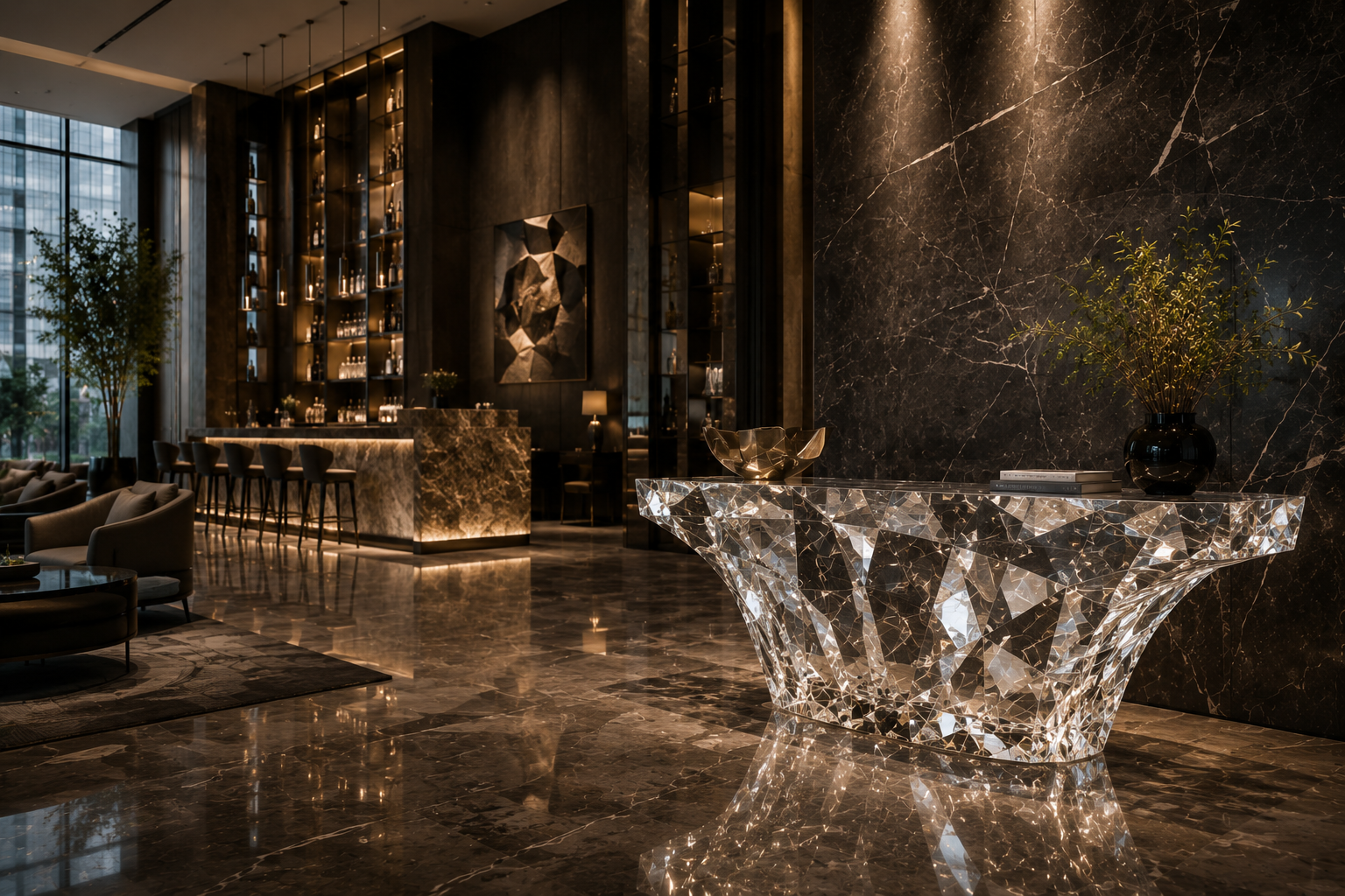
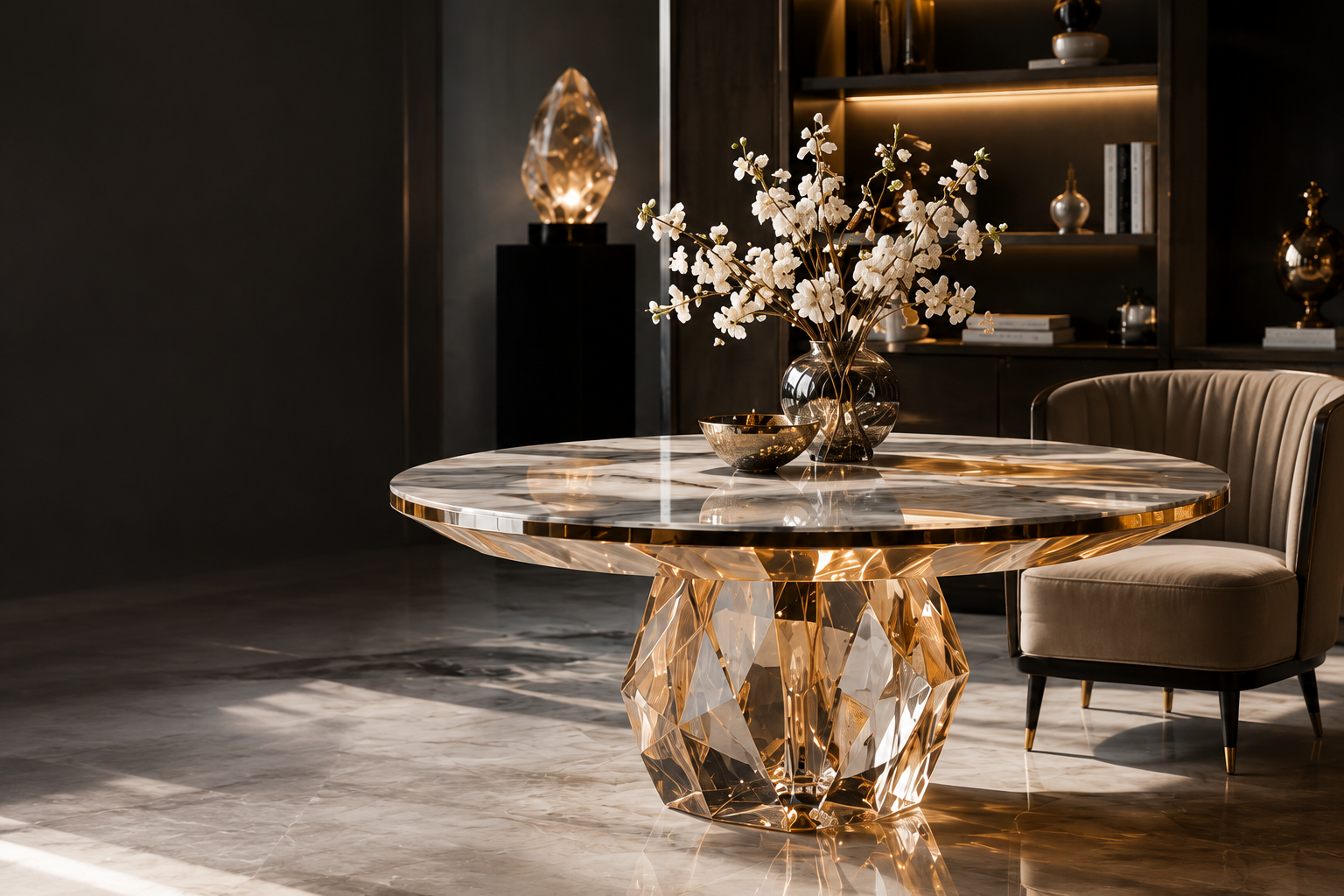
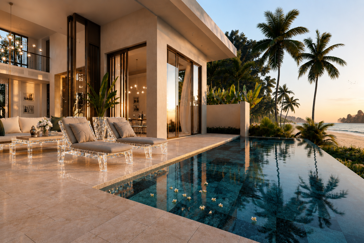
Transparent and reflective materials are especially powerful in compact spaces. Acrylic, glass, mirror, polished metal, and glossy lacquer can all increase visual openness, but they create different effects. Mirror doubles visual depth but can become visually busy. Glass feels elegant but may read as fragile or sharp depending on context. Acrylic offers clarity with a softer, more sculptural presence and can be molded into rounded forms that feel contemporary and approachable.
Consider a narrow entryway. A wooden console may provide useful storage, but it can also make the corridor feel tighter. A clear acrylic console creates a landing surface for keys and décor while preserving sightlines. In a small dining area, acrylic dining chairs can reduce visual clutter around the table. In a boutique retail store, acrylic display blocks can elevate products without distracting from them. The material becomes a tool for spatial editing.
Large spaces require a different approach. A spacious living room filled only with light, transparent materials may feel weak or temporary. It needs grounding elements: a substantial rug, textured wall, stone surface, wood cabinetry, or upholstered seating. Here, acrylic or glass should be used as contrast rather than the main language. A sculptural acrylic table beside a heavy sofa can create tension between mass and lightness. That contrast is often what makes the room feel curated.
Material scale is equally important. Large-format stone slabs, wide-plank flooring, seamless wall panels, and oversized acrylic furniture pieces can reduce visual fragmentation. Smaller tiles, busy grains, and repeated seams can make a space feel more ordinary if not carefully controlled. Premium interiors often use fewer breaks and cleaner transitions because continuity reads as confidence.
Lighting intensifies this effect. A material may look ordinary under flat overhead light but luxurious under layered lighting. Wood grain becomes richer under warm grazing light. Stone veining becomes dramatic when illuminated from the right angle. Acrylic edges glow when they catch light, giving a room a gallery-like quality. This is why material selection should happen together with lighting design, not separately.
In real projects, the difference can be dramatic. A simple white room with basic furniture may feel rental-grade. Add a carefully selected floor finish, a clear acrylic statement table, warm wall lighting, a textured fabric sofa, and brushed metal accents, and the same room begins to feel intentional. The architecture has not changed, but the material reading has.
5. Durable and sustainable materials create long-term luxury
Luxury is often misunderstood as newness. In reality, long-term luxury depends on how well a space ages. A premium material should not only look beautiful when installed; it should remain useful, repairable, cleanable, and emotionally desirable over time. This is where durability and sustainability become part of quality rather than separate ethical concerns.
The building and construction sector has a major environmental footprint. UNEP reports that the buildings and construction sector accounts for a substantial share of global emissions, and the production and use of materials such as cement, steel, and aluminum have significant carbon footprints. World Green Building Council also emphasizes that buildings are responsible for a large share of energy-related carbon emissions, including emissions from materials and construction.
For interiors, this means material choices should be evaluated beyond appearance. A cheap surface that needs replacement every few years may be more costly and wasteful than a higher-quality material that can be repaired or refinished. A durable acrylic table, a solid wood cabinet, a stone surface that can be resealed, or a metal component that can be polished may offer better long-term value than a low-cost substitute that degrades quickly.
Circular design also changes how designers think about premium materials. The Ellen MacArthur Foundation describes the circular economy as a system based on eliminating waste and pollution, circulating products and materials at their highest value, and regenerating nature. Applied to interiors, this means choosing materials that can be maintained, reused, recycled, repaired, or responsibly sourced.
Wood is a useful example. It can feel warm, timeless, and premium, but its value depends on sourcing and construction. FSC-certified wood supports responsible forestry systems and helps buyers identify wood products connected to more responsible forest management. For clients, this adds a deeper layer of quality: the material is not only beautiful but also traceable.
Sustainability also includes emotional durability. A material that follows a short-lived trend may look dated quickly, while a material chosen for proportion, texture, and context may remain relevant. Clear acrylic furniture, for example, has endured across decades of modern interiors because it solves recurring design problems: visual lightness, flexibility, and sculptural clarity. Natural wood remains desirable because it brings warmth and variation. Stone continues to signal permanence because it carries geological depth. Metal remains useful because it provides precision and strength.
In commercial settings, durable materials directly affect operational costs. Hotels need surfaces that resist staining, cleaning chemicals, and heavy use. Restaurants need tables and seating that can withstand repeated contact. Retail spaces need displays that protect products while maintaining visual clarity. Offices need materials that can support flexibility as teams change. In each case, premium quality is measured not by how expensive the material looks on day one, but by how well it performs on day one thousand.
A truly elevated space therefore respects time. It reduces unnecessary replacement, supports maintenance, and allows materials to age gracefully. That is why durability is not the opposite of luxury; it is one of luxury’s foundations.
6. The strongest material choices tell a coherent brand or lifestyle story
Every material communicates. Marble may suggest permanence and luxury. Oak may suggest warmth and natural living. Stainless steel may suggest precision and professionalism. Acrylic may suggest modernity, clarity, lightness, and display value. Fabric may suggest comfort. Leather may suggest maturity. The best interiors choose materials that support a coherent story rather than assembling fashionable pieces at random.
This is especially important for branded spaces. A boutique selling jewelry may use acrylic display stands because transparency keeps attention on the product and creates a clean, gallery-like presentation. A wellness clinic may use light wood, mineral surfaces, low-emitting finishes, and soft textiles to communicate calm and health. A creative office may combine exposed structure, recycled materials, acoustic panels, and flexible furniture to express innovation and adaptability. A luxury apartment may use stone, warm wood, brushed metal, and clear acrylic accents to balance permanence with contemporary openness.
The story must also fit the user’s daily reality. A family home should not use fragile materials everywhere just to look luxurious. A busy restaurant should not choose surfaces that stain easily. A rental apartment should prioritize upgrades that are durable, photogenic, and broadly appealing. A small showroom should use transparent and reflective materials to maximize product visibility. A premium interior is not the most dramatic version of a concept; it is the most appropriate version.
Material consistency helps create this appropriateness. If a space uses too many competing finishes, the result feels chaotic. If it uses too few, it may feel flat. A practical rule is to build a palette around three levels: a foundation material, a contrast material, and an accent material. The foundation might be wood flooring or neutral wall finish. The contrast might be stone, metal, or textured fabric. The accent might be acrylic, glass, leather, or a distinctive color. This structure allows variety without confusion.
For example, in a modern living room, the foundation could be warm oak flooring and soft white walls. The contrast could be a charcoal fabric sofa and brushed metal lighting. The accent could be a clear acrylic coffee table. The acrylic piece elevates the room because it adds modern clarity without blocking the visual warmth of the wood. In a retail environment, the foundation could be matte walls and polished concrete flooring. The contrast could be black metal shelving. The accent could be acrylic risers and display cubes that make the merchandise appear more valuable.
The most persuasive spaces feel inevitable. The materials appear to belong together because each one has a role. Nothing feels accidental. Nothing feels fake. Nothing feels chosen only because it was trendy. This coherence is what transforms a room from ordinary to premium.
Conclusion: one material choice can change the entire reading of a space
A single material decision can elevate a space because materials operate at multiple levels at once. They affect beauty, touch, light, sound, air quality, durability, sustainability, maintenance, value, and emotional meaning. This is why professional designers treat material selection as a core strategy rather than a finishing detail.
The upgrade from ordinary to premium does not always require a full renovation. Sometimes it begins with replacing one visually heavy piece with a transparent acrylic element, changing a low-quality floor finish to real wood, selecting low-emitting paint, adding a stone surface where durability matters, or using textured fabric to soften an overly hard room. The result is not merely a better-looking space. It is a space that feels more considered, more comfortable, more functional, and more valuable.
True spatial quality is created when material, purpose, and experience align. The best material choice is not the one that shouts the loudest. It is the one that makes the entire room feel more complete.
READ MORE:
- Which Commercial Scenarios Are Best for Platinum Acrylic? Application Strategies from Showrooms to Retail Stores
- How Premium Materials Help Commercial Spaces Elevate Brand Image
- High-End Commercial Material Selection Guide: Don’t Judge by Looks Alone—Evaluate Maintenance Cost First
- Platinum Acrylic in High-End Spaces: Beautiful, Durable, and Easy to Maintain
- Synthetic Crystal Acrylic Furniture: The Light-Luxury Visual Answer for Modern Homes
- One Piece of Furniture That Lets Light, Space, and Texture Be Seen at the Same Time
- Beyond Decoration: How Synthetic Crystal Acrylic Furniture Elevates the Character of a Space?
- Why Is High-End Design Increasingly Pursuing an “Invisible Presence”?
- Synthetic Crystal Acrylic Furniture: Giving Spaces a “Breathing Sense of Transparency”


