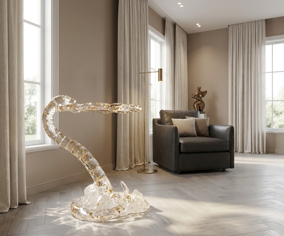
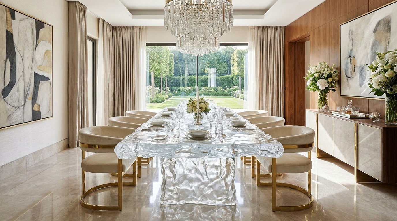
For interior designers seeking to balance luxury, lightness, and cohesive spatial flow, synthetic crystal furniture has emerged as a transformative material category. Unlike natural crystal with inherent color inconsistencies, man-made variants offer precise tone control to align with any interior palette. This guide breaks down data-backed color design frameworks for integrating these pieces seamlessly into residential and commercial spaces.
1. Material Tone Fundamentals of Synthetic Crystal Furniture
Synthetic crystal furniture derives its color versatility from controlled manufacturing processes that manipulate raw material composition. Understanding core tone properties is the first step to intentional color design.
1.1 Color Consistency Advantages Over Natural Crystal
Natural crystal pieces often have uneven hue distribution, internal inclusions, and size limitations that restrict design flexibility.
Artificial crystal furniture eliminates these variables through factory-controlled production, delivering uniform color across every surface.
A 2023 furniture materials study found synthetic variants offer 98% color consistency across batch production, compared to 62% for natural crystal.
Key tone consistency benefits include:
Uniform color matching across multiple pieces in a single space
Predictable light refraction patterns for planned lighting design
Scalable production for large-scale commercial projects
1.2 Role of High-Purity Optical-Grade Materials in Color Clarity
The color vibrancy and clarity of synthetic crystal furniture depend heavily on raw material purity levels.
High-purity optical-grade materials, with 99.99% silica content, produce richer, more true-to-tone colors that do not appear cloudy or washed out under different lighting conditions.
Lower-grade materials often develop a yellowish tint over time, disrupting long-term color harmony.
Core performance metrics for high-purity variants:
92% light transmittance for bright, luminous color presentation
High surface hardness (Mohs 7) that resists scratches that can distort color appearance
UV resistance that prevents color fading for 10+ years of indoor use
2. Color Matching Frameworks for Interior Spatial Coordination
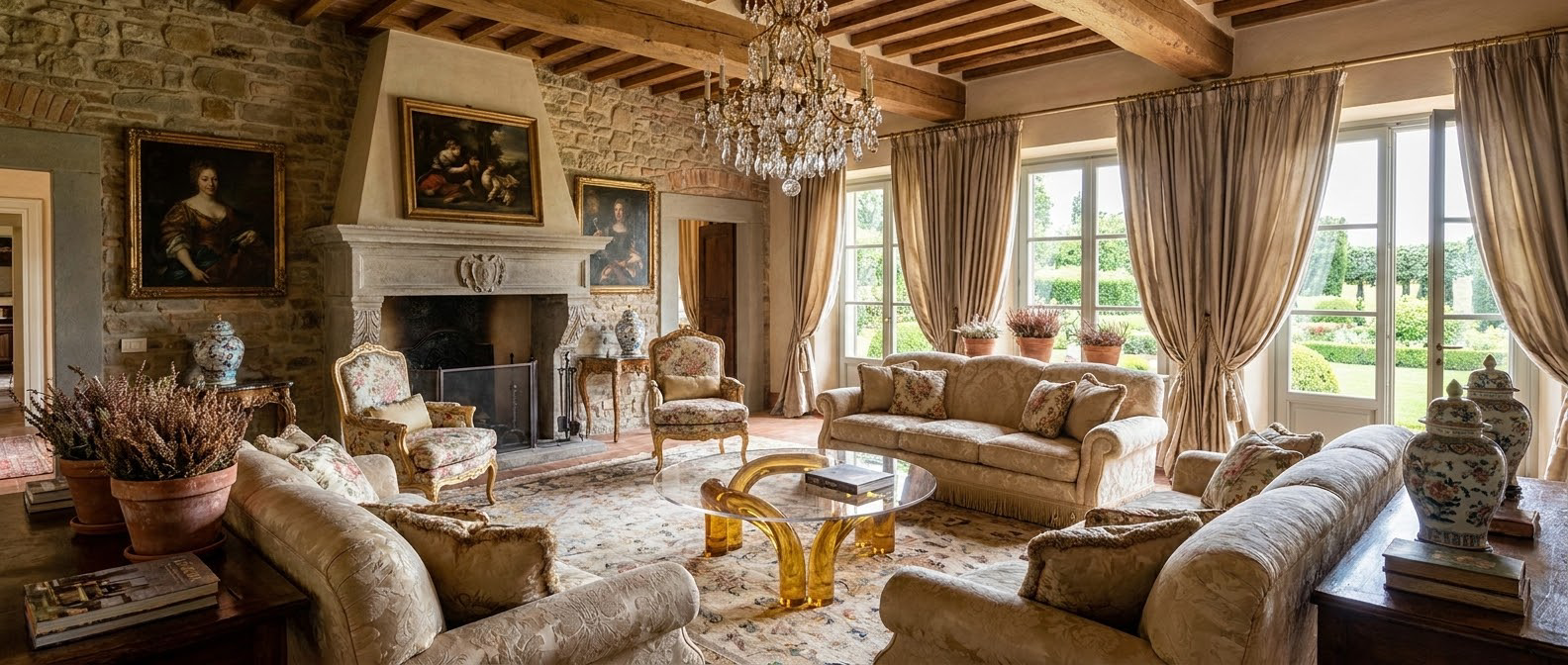
Successful color design with synthetic crystal furniture relies on aligning material tones with existing space elements, from wall paint to flooring and upholstery. These evidence-based frameworks simplify the matching process for design professionals.
2.1 Monochromatic Tone Layering for Minimalist Spaces
For minimalist and modern interiors, monochromatic layering creates subtle depth without visual clutter.
This approach uses different shades of the same color family across synthetic crystal tables, seating, and decor accents.
For example, a pale smoke-gray crystal coffee table pairs with medium charcoal synthetic crystal chairs and deep gray wall art for a cohesive, layered look.
Implementation best practices:
Limit color variation to 3-4 shades within the same hue family
Use clear crystal accents to add visual breaks between darker tones
Match undertones (warm vs. cool) to avoid clashing with existing wood or metal finishes
2.2 Complementary Color Accenting for Focal Point Design
Complementary color schemes use synthetic crystal furniture as a bold focal point that contrasts with surrounding space elements.
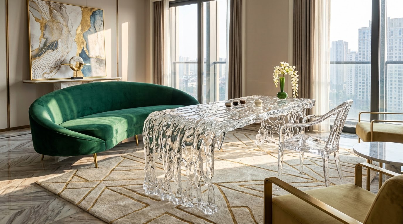
For instance, a cobalt blue crystal dining table stands out against warm terracotta walls, creating dynamic visual interest while maintaining balance through proportional color distribution.
Interior designers often follow the 60-30-10 rule for this approach, with crystal furniture making up 10% of the total color palette.
Tips for balanced complementary design:
Use neutral base colors (white, beige, gray) for 60% of the space to ground bold accents
Limit complementary crystal pieces to 1-2 per room to avoid visual overload
Repeat small amounts of the accent color in decor (vases, picture frames) to tie the space together
3. Product-Specific Color Design for Synthetic Crystal Tables and Chairs
Different furniture categories require tailored color strategies based on their size, function, and placement in a space. Synthetic crystal tables and chairs, the most popular product variants, each have unique color design considerations.
3.1 Synthetic Crystal Tables: Balancing Size and Color Intensity
Tables are often the largest synthetic crystal furniture pieces in a space, so their color sets the tone for the entire room.
Larger dining tables work best with soft, low-saturation tones (pale pink, light blue, clear) that do not overwhelm the space.
Smaller side tables and coffee tables can use bolder, high-saturation colors as statement pieces without disrupting overall harmony.
Color selection guidelines by table type:
Dining tables (6+ seats): Clear, frosted white, or pale neutral tones to maintain an open, airy feel
Coffee tables: Medium-saturation tones that complement sofa upholstery
Side tables: Bold accent colors that match artwork or throw pillows
3.2 Synthetic Crystal Chairs: Color Coordination with Table and Flooring
Chairs act as connecting elements between tables, flooring, and other room features, so their color must bridge multiple design layers.
For cohesive design, match chair undertones to flooring material: cool crystal tones for marble floors, warm crystal tones for hardwood.
Synthetic crystal chairs also offer the option of colored seat inserts that can be swapped to refresh the space without replacing the entire piece.
Chair color matching rules:
For all-crystal chairs: Match 70% of the table’s color intensity for visual balance
For crystal-framed chairs with upholstered seats: Align crystal frame color with metal hardware in the room
For commercial spaces: Choose stain-resistant, high surface hardness crystal finishes that retain color vibrancy despite heavy use
4. Lighting Impacts on Synthetic Crystal Furniture Color Presentation
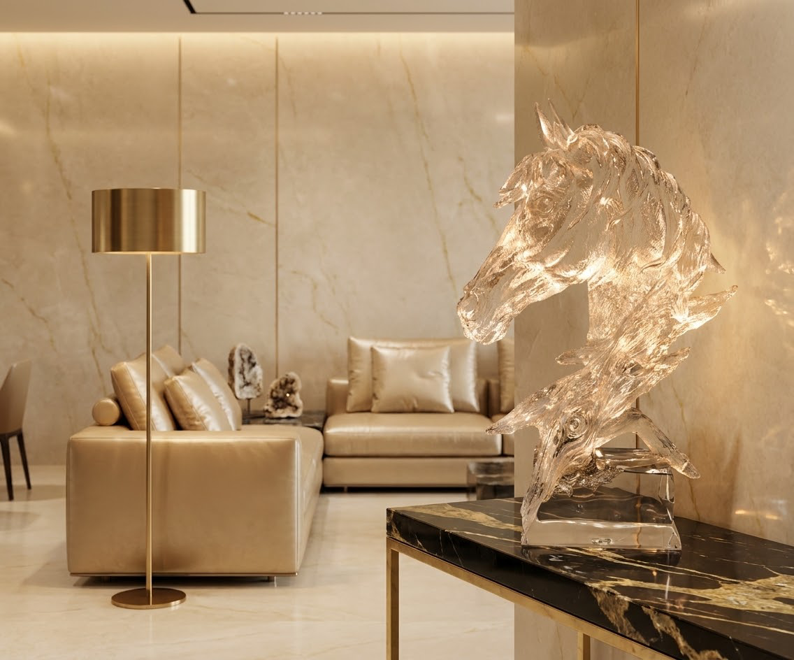
Lighting is a critical yet often overlooked factor that alters how synthetic crystal furniture colors appear in a space. Different light temperatures and intensities can shift tone perception, so color design must account for planned lighting schemes.
4.1 Natural Light Effects on Color Tone Perception
Natural light changes throughout the day, shifting from warm golden tones in the morning to cool blue tones at midday.
High-purity optical-grade materials respond to these shifts more predictably than lower-quality variants, maintaining consistent color character even as light intensity changes.
For south-facing rooms with strong natural light, choose cooler crystal tones to balance warm afternoon sun.
Natural light adaptation tips:
Test color samples in the actual space at different times of day before finalizing selections
Use sheer window treatments to diffuse harsh midday light and prevent color fading
For north-facing rooms with limited natural light, opt for warm-toned crystal pieces to add coziness
4.2 Artificial Light Tuning for Desired Color Effects
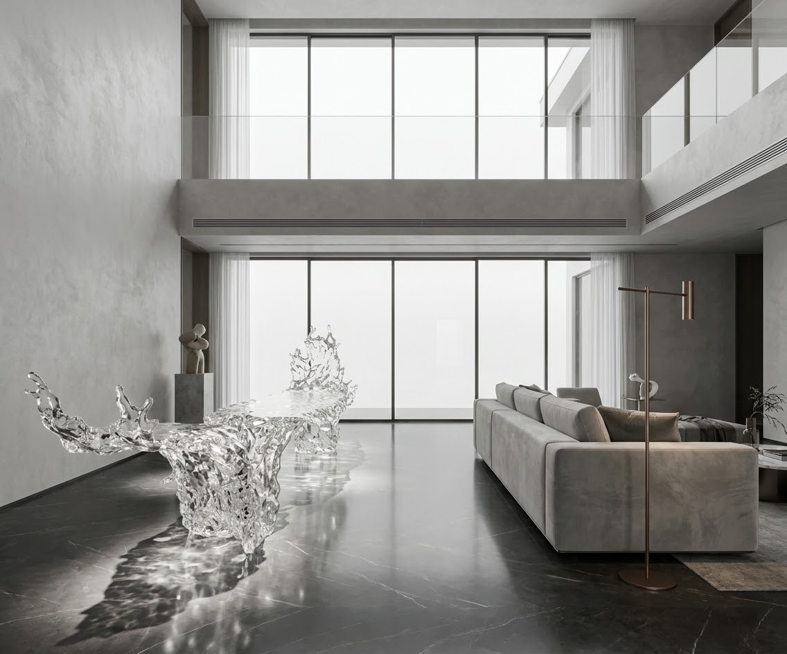
Artificial lighting offers full control over how synthetic crystal furniture colors appear, making it ideal for commercial spaces with specific brand identity requirements.
Warm white light (2700K-3000K) enhances warm crystal tones like amber and rose gold, while cool white light (4000K-5000K) amplifies cool tones like sapphire and emerald.
RGB lighting systems can even dynamically change crystal furniture colors to match different events or moods.
Artificial light configuration best practices:
Place accent lighting at 45-degree angles to maximize light refraction and color depth
Use dimmers to adjust light intensity for different occasions
Avoid direct overhead lighting that can create harsh glares on high surface hardness crystal surfaces
5. Practical Implementation Workflow for Interior Designers
Translating color design theory into real-world projects requires a structured workflow that accounts for client preferences, space constraints, and material performance. This step-by-step process ensures consistent, high-quality results.
5.1 Pre-Design Assessment and Sample Testing
Before selecting synthetic crystal furniture colors, conduct a full audit of the space’s existing color palette, lighting conditions, and functional requirements.
Request physical color samples from manufacturers, as digital renderings often do not accurately capture the translucent quality of crystal materials.
Test samples in the actual space for 3-5 days to evaluate how they look under different lighting conditions.
Pre-design checklist:
Document existing wall, floor, and upholstery colors with a calibrated color meter
Measure natural light levels at different times of day
Confirm functional requirements (stain resistance, weight capacity, durability)
5.2 Post-Installation Color Adjustment and Maintenance
After installation, make minor lighting and decor adjustments to refine color harmony and ensure long-term color retention.
For artificial crystal furniture with high surface hardness, use non-abrasive cleaning products to avoid scratches that can distort color appearance.
Schedule annual color inspections to identify any fading or discoloration early, especially for pieces in high-sunlight areas.
Long-term color maintenance tips:
Apply UV-protective film to windows near crystal furniture to prevent fading
Rearrange decor seasonally to refresh color balance without replacing furniture
Keep cleaning supplies on hand to remove smudges that can dull color vibrancy
In conclusion, synthetic crystal furniture offers unprecedented color design flexibility for creating visually harmonious interior spaces. By leveraging high-purity optical-grade materials, following evidence-based color matching frameworks, and accounting for lighting effects, interior designers can create stunning, cohesive spaces that balance luxury and functionality. The key is to approach color design holistically, considering every element of the space from flooring to lighting to ensure the final result feels intentional and unified.
READ MORE:
- Synthetic Crystal Furniture: Core Logic for Building Cohesive High-End Interior Design Language
- How Interior Developers Formulate Custom Design Strategies for Synthetic Crystal Furniture
- Synthetic Crystal Furniture: Material Contrast and Spatial Composition with Matte Finishes and Natural Textures
- Synthetic Crystal Furniture: Collaborative Design of Functional Zoning and Furniture Configuration in Multi-Functional Interior Spaces
- Il costo di una sedia in cristallo sintetico non è il prezzo d’acquisto: ecco cosa incide davvero sul costo totale del progetto
- Come un hotel 5 stelle ha risolto i problemi di realizzazione del suo pezzo iconico con cristallo sintetico
- Come abbiamo realizzato 20 sedie in cristallo sintetico dal design curvo per un hotel boutique di lusso rispettando tempi e qualità
- Non vendiamo solo cristallo sintetico: aiutiamo i progetti di lusso a trasformare il concept in realtà senza perdere l’intento di design
- Il cristallo sintetico è davvero adatto a tutti i progetti di arredamento per hotel?


