In today’s visually driven design landscape, color has evolved from a decorative element into a strategic decision-making tool. Whether in product design, branding, or e-commerce interfaces, users often form their first impression within 0.3 seconds—and color is the dominant factor in that instant judgment. A well-executed color scheme not only enhances visual appeal but also significantly influences user emotion, engagement time, and conversion rates.
However, many designers face a common challenge in their daily work: a lack of inspiration for color matching. When creativity stalls and design becomes repetitive, relying solely on experience is no longer enough. This often leads to “safe but mediocre” color choices. Therefore, building a systematic approach to sourcing and applying color inspiration is essential for consistently producing high-performing designs.
This article breaks down five powerful sources of color inspiration and provides actionable strategies to help you consistently create compelling, market-ready color schemes.
1. Fundamental Color Logic: The Foundation of High-Quality Design
Before seeking inspiration, it’s critical to understand that inspiration cannot replace fundamentals. Skilled designers are those who can transform inspiration into structured, repeatable solutions.
Color is defined by three core attributes: hue, brightness (value), and saturation. Hue determines the type of color (red, blue, green), brightness defines lightness or darkness, and saturation controls intensity and purity. The interaction of these three dimensions shapes the overall visual outcome.
Common effective color strategies include contrast schemes (using complementary colors to create visual impact), analogous schemes (using neighboring colors for harmony), and monochromatic schemes (using variations in brightness and saturation for depth and sophistication).
Color psychology also plays a crucial role. For example, blue conveys trust and professionalism, making it popular in tech and finance. Red creates urgency and excitement, often used in promotions. Green is associated with nature and health. In design, color is not just visual—it is emotional and strategic.
2. Source One: Nature as the Ultimate Color System
Nature is one of the most reliable and refined sources of color inspiration due to its inherent balance and harmony. Every natural scene has been “optimized” over time, making it visually pleasing and structurally sound.
On a macro level, seasonal changes provide complete color systems. Spring features soft, bright tones that evoke freshness. Summer brings high saturation and strong contrasts. Autumn emphasizes warm, rich hues, while winter leans toward cool, muted palettes that convey minimalism.
On a micro level, elements like skies, oceans, and plants offer layered and dynamic color relationships. The key is not to copy nature directly, but to extract and translate its color logic into usable palettes.
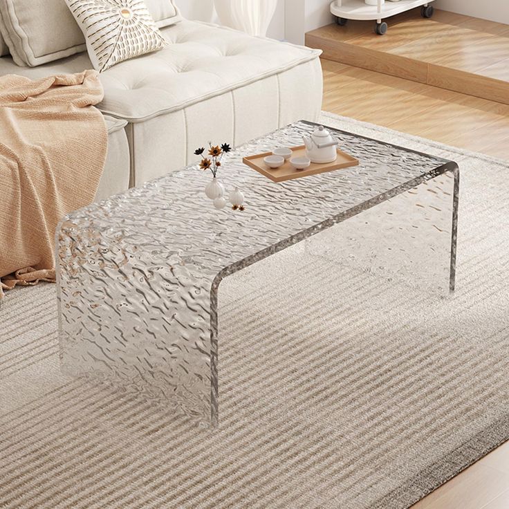
This approach is particularly effective in areas such as interior design, acrylic furniture, and product design, where comfort and visual longevity are essential.
3. Source Two: Brand Visual Systems and Market Trends
If nature offers “safe” solutions, brands offer “validated” ones. Established brands develop their color systems through extensive testing and market feedback, making them highly valuable references.
A typical brand color system includes a primary color (for identity), secondary colors (for flexibility), and accent colors (for emphasis and action). Understanding how these elements interact—and in what proportions—is key to applying them effectively.
Market trends are equally important. By analyzing popular products on e-commerce platforms or trending visual campaigns, designers can quickly identify current color preferences. For instance, low-saturation “premium gray” palettes are widely used in high-end markets, while bold contrasts perform better in fast-paced digital environments.
The goal is not imitation, but extraction of patterns and transformation into reusable design frameworks.
4. Source Three: Design Platforms and Trend Resources
In the digital age, platforms like Behance, Dribbble, and Pinterest are essential for discovering global design trends. They provide access to high-quality work from top designers across industries.
However, effective inspiration requires more than casual browsing. Focus on high-engagement projects—those with strong likes, shares, and saves—as they often reflect current aesthetic standards. Analyze the structure behind the colors, not just the surface visuals.
Additionally, Pantone’s annual color reports and trend forecasts offer valuable insights into global cultural and consumer shifts. These resources help designers stay ahead of trends rather than react to them.
Building a personal inspiration library—organized by style, industry, or emotion—can greatly improve efficiency and consistency.
5. Source Four: Art and Cultural Systems
Art represents one of the highest forms of color exploration. From classical paintings to modern cinema, artistic disciplines push the boundaries of color expression far beyond commercial design.
Artistic color usage often emphasizes emotion, contrast, and storytelling. These principles can be adapted into commercial contexts by simplifying and restructuring them for usability.
Cultural differences also play a significant role in color perception. Eastern design often favors subtlety and layered tones, while Western design tends to embrace bold contrasts and direct communication. Understanding these differences is crucial in global design strategies.
By translating artistic and cultural color logic into practical applications, designers can elevate their work to a more sophisticated level.
6. Source Five: Data-Driven Color Strategies
As design becomes increasingly data-driven, color decisions are no longer based solely on intuition. User behavior data can reveal how different color schemes impact engagement and conversion.
A/B testing is a common method for evaluating performance. By comparing variations, designers can identify which color combinations yield the best results—especially in e-commerce and advertising.
Market differences are also significant. Western audiences often prefer minimal, low-saturation designs, while Asian markets may respond better to vibrant, high-contrast visuals.
Data should not replace creativity, but rather refine and validate it. The most effective approach combines intuition with measurable insights.
7. From Inspiration to Execution: Turning Ideas into Results
Inspiration alone has no value unless it is implemented effectively. A structured workflow is essential for transforming ideas into tangible outcomes.
Start by building a personal color library, categorizing palettes for quick access. Use tools like Adobe Color to generate and refine schemes efficiently.
During the design process, define the primary color direction early and build the visual system around it. Avoid common pitfalls such as overusing too many colors or lacking sufficient contrast.
By optimizing your workflow, you can convert inspiration into a consistent and scalable design capability.
8. Conclusion: From Inspiration to Systematic Mastery
The real challenge in color matching is not the absence of inspiration, but the absence of method. Once you establish multiple reliable inspiration sources and learn how to apply them systematically, you can move beyond unpredictability and achieve consistent results.
In the future, design competition will not be driven solely by creativity, but by systems and processes. Color is one of the most powerful tools within that system.
When you can control color intentionally—rather than waiting for inspiration—you transform best-selling design from a coincidence into a repeatable outcome.
Contact
LinkedIn: https://www.linkedin.com/in/adtender-zyra/?locale=zh_CN
Facebook: https://www.facebook.com/profile.php?id=61586259131631
Instagram: https://www.instagram.com/zzzzyyrraa4/
YouTube: https://www.youtube.com/@ZZZZyra-k7w
Office: (904) 258-3290
WhatsApp/Wechat: +86 18923188839
READ MORE:
- From Failed Execution to Flawless Result — A Crystal Sculpture Reimagined
- Can lighting be integrated into structural transparent elements?
- How do you achieve seamless joints in complex shapes?
- Can thick Synthetic Crystal maintain clarity without distortion?
- From Material Fatigue to Repeat Purchases: How Durability Drives Long-Term Value
- Furniture Industry Trends: Regional Demand Shifts & Product Opportunities
- Is Transparent Material Worth It? Acrylic vs Other Materials—Full Comparison
- How to Choose Furniture Colors? 3 Tips Combining Color & Transparency for a Premium Look
- The Deeper Insights from Milan Expo: Consumers Are No Longer Just Buying 'Things', They Are Buying 'Feelings'


